
This chart wants you scared, not informed (and that’s a good thing)
In Impact Architects’ recent Data Visualization for Communicating Impact webinar, I said that one of the most fun things about data visualization is seeing visualizations in the wild and having something informed to say about them. “The wild” might mean a report you came across, reading your daily news, or a LinkedIn post. But sometimes, it’s more literal.
I visited Provincetown in Cape Cod a couple of weeks ago, and on our walk to the beach, I saw this huge sign:

Public safety announcement on Provincetown, MA beach warning of sharks.
The shark is interesting, but I was actually more interested in the column chart in the bottom left. Literally, a data visualization in the wild.
I couldn’t help but break down the chart to my patient and understanding wife and dog, and I returned to a few things I discussed in our data visualization webinar. This chart follows a lot of the basic principles that make data visualizations effective.
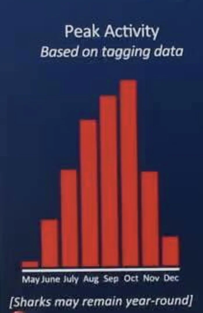
Column chart of shark activity by month.
Chart type: Column (vertical, like a column in a building) and bar (horizontal, like bartops) charts are among the most straightforward charts to interpret. It’s pretty easy to immediately see when shark activity is highest.
Color: Whoever made this chart could have chosen any color other than the one that matches the background, but they chose red. It might not be too difficult to understand why. For most people who see it, red evokes danger and hammers home the warning — just in case the gigantic shark didn’t get that message across.
Title: The observer will know right away that the chart represents shark activity and that August through October are the months with the most activity.
While the chart displays three of the hallmarks of effective data visualizations, it also breaks a couple of rules, the most obvious one being that there’s no y-axis. In fact, there are no numbers at all in the chart. What is the specific difference between “activity” in August compared to May? And what exactly does “activity” mean? The audience doesn’t know based on the information provided.
But that’s not to say the chart is “bad,” and it certainly doesn’t mean it isn’t effective communication. On the contrary, this is an instance of knowing the rules to break the rules. The point of the chart is not to give a detailed overview of shark activity, and it certainly doesn’t want to encourage anyone to see a number and think it doesn’t seem like much, concluding that coming across a shark is unlikely. The point is to elicit caution and awareness. Numerical data would distract from that message.
The point of explanatory data visualization is to communicate a message, not merely to provide data. This does the job. And as a visual bonus, the column chart kind of looks like a shark’s dorsal fin.
The other rule it breaks is that three months are missing: January, February, and March. This could be because the data are so minimal that they wouldn’t show up in a chart, but it also just might be a case of knowing the audience. Hypothermia may be the greater danger in those months.
That's the lesson here: Every chart is a series of choices, and the best ones are made with a clear message in mind. The next time you're at a museum, at the grocery store, walking down the street, or scrolling LinkedIn, look for the data visualizations hiding in plain sight. Ask what they're trying to tell you, and whether they made the right calls to do it. You might be surprised how much you start noticing. And if you want some points on what exactly to look for, check out our webinar or reach out directly.
We don’t bite.
eric@theimpactarchitects.com